2020: A Year in Review

Well we’re finally here — the end of 2020! Let’s all breathe a collective sigh of relief.

I don’t think anyone will be sad to see this year go. But for me, as difficult as this year was, there were still some very positive things I want to acknowledge and celebrate. As I took a look back last year and the year before, I want to take a retrospective look at some of the things I accomplished in 2020.

Perhaps one of the biggest ironies is that the year really started to pick up around September and was a mad dash until the end of December. In that time, I recorded the bulk of this year’s podcast guest spots, so you never know when good things are gonna happen!

Before I dig into all the things I did do, though, I want to take a moment to acknowledge something that didn’t happen. For the first time in 5 years, I opted not to publish a new list of “100 Awesome Independent Album and EP Releases You Probably Missed” for 2020. There were any number of reasons that I chose (not) to do this; partly because of the Covid-19 pandemic, partly because of different projects I worked on and the time commitments associated with them, and partly because my heart may possibly have not been totally in it. Sometimes we have things we need to take a step back from, and this year my “100 Independent Albums” list was one of those things.

Music is still core to my identity and brand though, and isn’t going anywhere; if you want a taste of the list, though, here’s 2019’s list, which itself includes links to all the prior ones. I hope to have the musical fire back in me in 2021, so here’s to looking forward to some phenomenal albums and EP’s next year!

So, with that, here are a few of my biggest highlights for the snafu that was 2020.

January

My girlfriend took me to IKEA for the first time!

Though I didn’t get my annual pic with Arlan this year, on a similar note I got to congratulate my friend Bryan Landers for joining Backstage Capital as its new partner! So that’s something. Always be celebrating others.

Was so humbled to be able to literally voice my support for my friend & ally Espree Devora on her “Women in Tech” podcast. This was a great way to start my “recording spots” for the year. (She’s since become the icon for the new Clubhouse app!). 🎙️

Started this year out with a bang! My article — “There’s Life After Failure” — was shared by my friend Bobby Umar into his network and ended up getting featured on the front page of an aggregate blog. 😮

February

I got my first real taste of going viral on LinkedIn. It wouldn’t be the last time (more on that below!).

Visited Denver, Colorado for the first time with this beautiful girl! ✈️

Denver has amazing food!

And mountains! 🏔️

Started the “I Am Vow” graffiti thing again… (I might need to write an entire article just on this alone…stay tuned…) 😉

Went skiing for the first time! I did…ok. 🎿

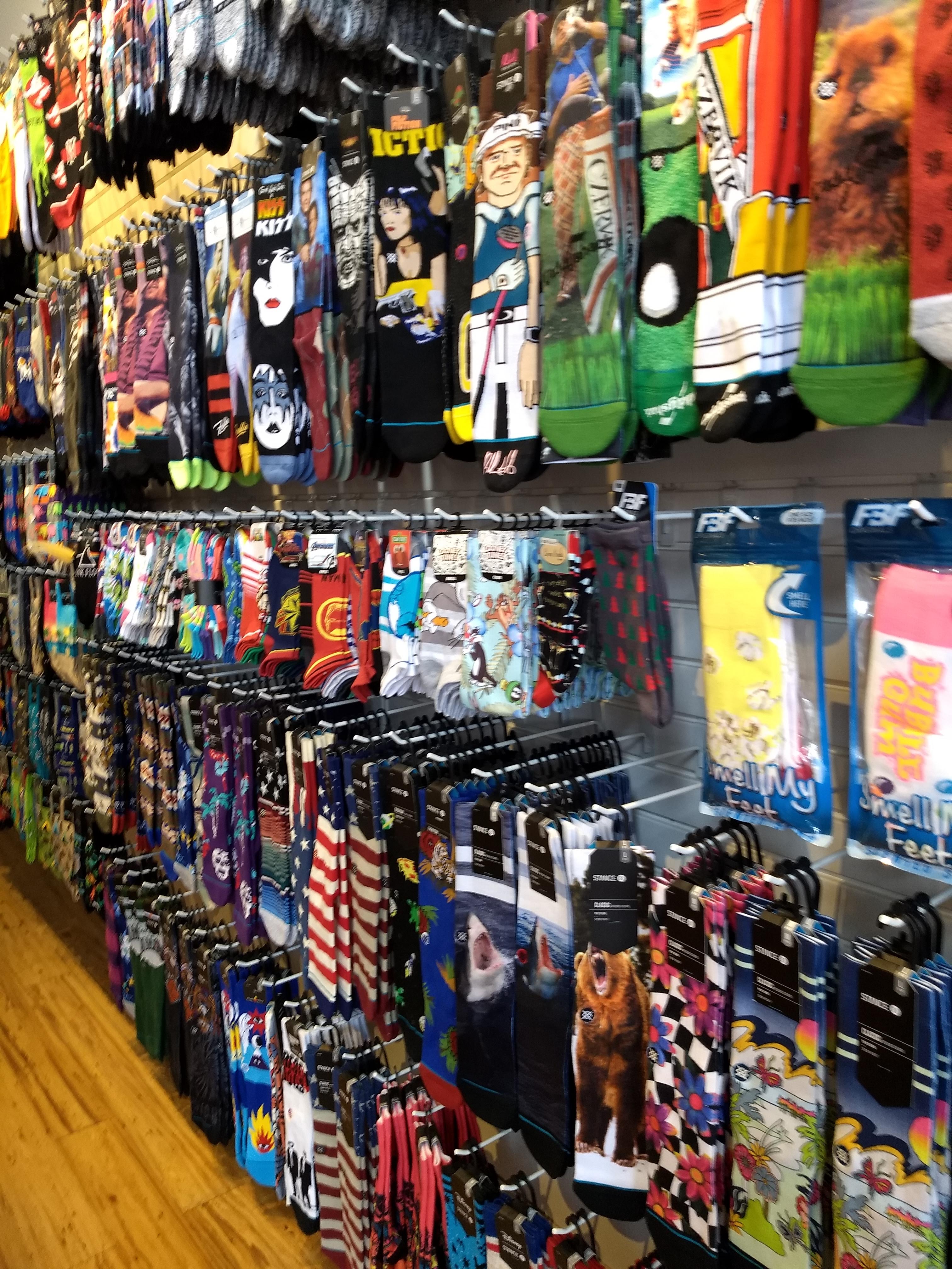
And Boulder has cool socks!

Back in Atlanta, had a fantastic meeting with the brilliant David Lightburn of Atlanta Ventures and the Atlanta Tech Village down at ATV (before Covid!). Looking forward to our next chat in the beginning of 2021!

Wonderful Valentine’s Day with this one — made her a collage. ❤️

I had my first call of the year with Aly Merritt. Little did I know what that zoom call would lead to!

Aly mentioned that she was working on a project and could use some help leading it. It was secret, though, for the time being.

The project?

Track captain for the Tech/Fintech track for TechStars’ inaugural Atlanta Startup Week! More on that later!

March

Covid-19 hit and we all began to understand that life was going to change pretty drastically for a long while.

I recognized that I may have missed my calling as a VC-inspired parody writer. Aileen Lee graciously put up with my ridiculous humor ha! 😂

Had my first virtual coffee (via Cuppa, thanks KP!) with Whit Anderson. Whit and I would spend the rest of the year building out an awesome dialogue around startups, no-code, networking, and the Atlanta tech scene!

Got retweeted by Gary V. to 2M people — my notifications subsequently blew up. 😱📈

Started celebrating Shabbat! 🕯️🕯️

The beginning of a consistent calendar of calls with Mubs — things started cooking. Mubs and I started having consistent chats — this would lead to exciting things later in the year.

The first of a year’s worth of awesome calls with my friend Dale Dupree, the master of the Sales Rebellion.

Published an article looking at why one of my posts went viral on LinkedIn. It seems that this would continue to be a theme throughout the rest of the year… 📈📈

April

I made my second #AdamMarxParodyProductions creation — Hunter Walk continues to put up with my humor as well. 😂

Chelsea made the best challah French toast!

Love April 19th — always a special day since Mom and Dad have the same birthday! 🎂

I started to really run my LinkedIn experiment on new strategies — with legitimate viral success! 🤔📈

Had an amazing opening call with my new friend Dr. Julie Gurner. We discussed the opportunities on LinkedIn, how to build great relationships, and possible projects together. Saw this pop up in my Twitter feed later that night and was just so humbled by the kind words! (She continues to tweet similar things and I’m so bowled over by the positivity every time she does!).

Did my first webinar, thanks to my LinkedIn friend Emmanuel Ndifor. We talked about how current students on campus could lean into social media tools to build out their networks and prepare for virtual job interviews when campuses and career centers remained closed. Discussing networking, branding, & how to build influential relationships from scratch was especially critical to helping students navigate the first steps of the job market during a time as difficult as the pandemic. 🎦

Great call with Wayne Sutton and so humbled by his kind words!

May

My brother turned 21 and I felt old. 🎂

Then I launched Branded Background (include link) with Mubs on Product Hunt! Out of a series of discussions that we had over zoom grew the idea that we could apply branding to all the zoom calls that people were having (and that were multiplying by the day!). I wrote about the reasoning for building it here. So we went heads-down for a week or so and kicked it out the door. It ended up doing 334 votes on Product Hunt!

We got some pretty cool traction and feedback from the Twitter and PH crowd that day! 😃🙌

Got retweeted by Product Hunt!

What really surprised us, though, was the response we got on it from the LinkedIn community.

Our final stats for the end of the day were pretty good for my first launch on Product Hunt. (We continued to rack up about another 150 votes after the initial launch day). 😉👏

Chelsea is part Cherokee, so I took her to New Echota here in Georgia — the last Cherokee capital east of the Mississippi River. Heritage is important.

Mom bought a new house and helped her move in! It’s now become our home away from home. 🏠

June

June was a little thin since we did our best to basically stay inside and be safe. But…moved into a new apartment! Still waiting to have our official housewarming party, but the new place is looking pretty good.

Cast my early vote in the primaries for my friend Jon Ossoff. 🗳️

Then road trip to Tulsa, OK to visit my Chelsea’s mom! We had the puppy in the back and he loves car rides. (Don’t worry, we were safe and socially distanced the whole time). 🚗

Found out that Alabama can’t decide if it allows dogs or not…

Had my first Sonic Drive-In burger ever! 🍔

Went to Joe’s Sno Shack — apparently it’s a Tulsa staple and it’s pretty damn good!

July

Headed down to the beach in Florida for a week away! Again, believe me that we observed social distancing pretty strictly; we drove, rented a house, brought our own food, didn’t eat out and stayed far away from everyone on the secluded beach. Was nice to have a few days outside Atlanta. 🏖️

Called on my alma mater Brandeis University to stand up for what was right. They answered in kind.

Here’s the piece I wrote about the whole experience.

Got an awesome gift from my friends Niv and Nick over at Shrug Capital!

I got ordained…in Ohio at least. I had to reassure my grandma there’s no religious context to it and I’m still a nice Jewish boy. 🤣

My friend JB sent me a copy of Arlan Hamilton’s new book!

I was super humbled to guest on Olga Kirshenbaum’s “9 Minutes of Creative Wisdom” podcast to talk about the intersection of money, creativity, networking, & branding! 🎙️

The episode would drop later in the year.

I was listed on LinkedIn influencer Derick Mildred’s list of “120 Rising Stars & Upcoming Influencers to Watch on LinkedIn”! 😮😁🙌

Here’s a link to Derick’s original LinkedIn post!

August

We had a major storm here in Atlanta, but I earned the name I shall be buried with:

Adam the Branch Slayer! 🌳

Helped my parents launch their official company website! ⚖️

Guested on the “Digital Introverts” podcast with Godwin Chan. recording should be out early next year! 🎙️

Celebrated this gorgeous girl’s birthday! The pets were there too. 🎂

September

Had a great time guesting on Bob Clark’s show “The OnFire B2B Podcast” to talk about networking and branding in the B2B space! 🎙️

It was one of the highlights of my year to sit down with LinkedIn super-influencer and my dear friend Rachel Beck on her podcast to discuss topics close to my heart like mental health, diversity, empathetic relationship-building, and my own Jewish identity. 😊🎙️

We broke the hour-long discussion up into multiple bits and I was thrilled to drop the first one just before the Jewish High Holidays this year.

Part 2

Part 3

October

Voted early on Day 1!

I finally decided it was time for a chance and a new image.

Celebrated one of the anniversaries I am lucky enough to celebrate with this wonderful girlfriend. It was one year ago October 19 that we met and the rest is pretty much history. ❤️

Recorded a LIVE guest spot on Simon Squibb’s show! Had a killer time talking networking, branding, core relationship cultivation techniques, and lending some of my expertise to a startup that live-pitched Simon and me! 🎙️

Was finally able to announce the work I had been doing with TechStars since Aly Merritt brought me on in February! 😃🙌

So proud of my brother for writing his first screenplay — and letting me read it! I had a few edits, but couldn’t put it down and read the whole thing in one night — yeah, it’s that good.

And if that wasn’t all, immensely proud of my parents for having their case picked up by FinLedger! Mary Ann Azevedo wrote a pretty amazing piece. 😮

The story was even the lead for that week in the FinLedger newsletter!

November

Joined my friend Mubs again for another launch — this time for the election! We launched HowManyPeopleVoted.com to try to keep track of the breakdown of officially counted votes in the 2020 U.S. general election. 🗳️

We started trending on Reddit! 😱

And then we got featured on the front page of Refdesk!

I was so immensely excited and humbled to work with TechStars on their inaugural Atlanta Startup Week! We ran it virtually from Nov. 9-13 and were able to pull together an amazing list of guest speakers for the Tech/Fintech track!

I wrote all about it here! 👍🙌

A couple highlights for me were seeing my mom speak on Day 1 about what it takes to have good company culture and the efforts that need to be made to keep it inclusive and respectful of everyone. Moderated by my friend Stefanie Jewett and also featuring my friend, LinkedIn influencer Elaine Jacques.

I was also able to lead my own panel and discussion, though the recording hasn’t been uploaded yet (I’ll update when it is!).

I had the pleasure of sitting down with LinkedIn influencer Cory Warfield, entrepreneur Jake Tital, and film-tech veteran Kate Atwood — all close friends of mine — to discuss what exactly it takes to build a magnetic and influential network from scratch. We drilled down into the nuances of networking, brand, what really works, and what really doesn’t, and what founders really should know about building their own networks.

And I wrapped up the week with a surprise guest spot during one of the last blocks for the event, a great talk between LinkedIn influencers Judi Fox and Dale Dupree — also people whom I’m truly inspired by — around branding, marketing, and how to build a persona that works.

My mom hung one of my paintings in her office. 🎨

And hung the other one in one of the main hallways.

I had a killer time guesting on Bob Sieger’s podcast “Coffee With Bob” after meeting him through my friend Rachel Beck. It’s true what they say: the more people you know, the more opportunities you see pop up! In fact, Bob had reached out to me after he heard my recording on Rachel’s show (as did others!), so I’m continually grateful to her for that opportunity. 🎙️

Bob and I connected immediately and it wouldn’t be our last time collaborating. 😉

December

Began December with a bang as I guested for the second time that week on a great cast where I could lend some value and expertise!

I had met Joey Womack through my work with TechStars on the Atlanta Startup Week (he’d also been a track captain and long been on a list of local “people to know” at the top of my list) and we had such a great conversation during the wrap-up captain meeting that he invited me to guest on his massive Goodie Nation #GivingTuesday live broadcast! 🎙️

We talked all about the best ways to build concrete relationships and I shared some of my own most unbelievable stories that Goodie Nation community members could really find actionable! He brought in so many talented guests to speak that he had to break it into two recordings lol! I guest on the first recording and come in around 5:23:15.

Here’s the link!

I came back again that week to do another video cast with my friend Bob on a very special holiday-themed live episode of “Coffee With Bob” and it was a blast meeting the other guests. Looking forward to catching up with them in the new year. 🎙️

I published my article “How I Went Viral by Ignoring One of the ‘Rules’ of LinkedIn” on the LinkedIn experiment that I ran all through the spring time. 📈📈📈

In it, I described how I used certain tactics in particular, one often recommended against — in my LinkedIn strategy to rack up more than 1.6 million post views over just about 12-15 posts.

Mubs and I redesigned HowManyPeopleVoted.com for the Georgia Senate runoffs!

And it was retweeted by Georgia State Senator Jen Jordan! 😱🗳️🙌

I wrote about our decision to redesign it here. It’s important to stay involved and we knew this was a project worth continuing forward on.

Celebrated my sister’s 26th birthday! 🎂

I turned 30. 🎂

Voted for the third time this year.

Had an awesome time guesting on the “Progressholics” podcast with Devesh Tilokani. 🎙️

Here’s the link!

Recorded my last guest podcast spot of 2020 with my friend & LinkedIn influencer Luke Williams on his “30 Conversations with Entrepreneurs” event and had an awesome time wrapping up the year discussing how people can begin or continue to build incredible networks in 2021. 🎙️

I’ll definitely be back for another chat on one of his casts!

Celebrated one year for the second night my girlfriend and I love to celebrate…which happens to also be my parents’ anniversary, funnily enough.

And this year they celebrated 40 years!

Took Chelsea to the Chattahoochee Nature Reserve on one of her break days to see some birds and plants. It was a great place to socially distance and she loves the outdoors!

It flurried a little in Atlanta. ❄️

One of my favorite bands Eve 6 liked one of my tweets — pretty good way to round out a tough year. 🎸

Reflecting on 2020

This was a hard year for everyone. There were a lot of challenges to overcome. But I’m grateful that at the very least I have people I love around me as I move into my 30s. Perhaps a little cliched, but that’s how I feel as this year draws to a close.

Even with this crazy pandemic, 2020 was a marathon year for me. I guested on numerous podcasts, launched multiple projects, and coordinated for a major tech event. I began building my brand around the Zero To One Networker persona and philosophy, and look forward to seeing that grow in the new year. On the personal, I formed wonderful memories with those closest to me.

As I said last year, no plan ever survives the battlefield. So while there were things I wanted to accomplish this year, I know they’re well on their way to happening next year. I’ve grown as a creator, builder, entrepreneur, and most importantly, as a person. As I move into a new decade of my life, I’m excited to see that continue!

An Artistic Analysis of Four Tech Investors

Seeing the World Through Artistic Eyes

Part of being an art student is that you inevitably see art everywhere, whether it’s meant to be noticed as art or not. This goes for anything—drawings, graffiti, cars, apps—and most recently for me, Twitter profile avatars.

Twitter avatar profile pictures of Fred Wilson (top left), Brad Feld (top right), Hunter Walk (bottom left), and Marc Andreessen (bottom right)

Twitter avatar profile pictures of Fred Wilson (top left), Brad Feld (top right), Hunter Walk (bottom left), and Marc Andreessen (bottom right)

As I was scrolling through my feed the other day, I saw a number of avatars go by, and my resulting thought process surprised even me—I thought wouldn’t it be cool to analyze those the way I used to analyze art pieces for my art history classes (well, cool is relative I suppose, but I’m an art nerd, so there). So that’s what today’s post is about: no talk of music, apps, or any major tech trends. Just an artistic analysis of the profile avatars of four tech investors. I wasn’t sure exactly how to order these, but I decided it would interesting to go according to an art history timeline, rather than simply by alphabetical order. Let the analyzing begin.

Fred Wilson

Fred Wilson‘s Twitter avatar is one of my favorites from an artistic perspective because of its striking power. I look at Wilson’s picture, which sets a large facial portrait against a lime-green background, and think immediately of the work of modern Austrian painter Egon Schiele (something which I’ve tweeted about numerous times). For those unfamiliar with Schiele’s work, he redefined the concept of portraiture in the early 20th century by daring to accentuate bodily features way outside their normal proportions. Some common aspects of Schiele’s work are overly-large eyes, and a strong, set jawline, usually defined by a sharp contour, which can clearly be seen in his pieces “Self Portrait” (1910) and “Self Portrait with Physalis” (1912).

Egon Schiele; left:

Egon Schiele; left: “Self Portrait” (1910); right: Self Portrait with Physalis” (1912)

Looking at Wilson’s picture, the enlarged eyes and clearly defined jawline fit the mold of Expressionism which Schiele helped to pioneer. The eyes are deep-set—almost sunken—but with a gleam that seems to burst from the canvas, made even brighter by the bold green that encapsulates the pupils. The cut jawline is mirrored at the top of the piece by raw, almost rugged strokes of brown making up Wilson’s hair. Yet while the zig-zag strokes chisel the top of the portrait in an almost sculpted way, the slight waviness of the hair on either side of Wilson’s heads help to capture a curved smoothness which bleeds out into the dynamism of the green background.

Fred Wilson Twitter avatar

Fred Wilson Twitter avatar

The life of the piece, though, is centered in the eyes, and the cheeks. The eyes swirl knowingly—disjointed only by the large space between them. The cheeks meanwhile, glow warmly with the only hot colors on the canvas: a roughly hewn pink which darkens towards the face’s edges. Even the the portions of the piece where the paint seems too thin are almost indicative of Schiele’s practice of leaving paintings unfinished. Collectively, Wilson’s avatar contains deep traces of Expressionism roots, though nodding to a lighter palette than was typically used in Europe at the time.

It’s also worth noting, however, that Schiele is not the only art master represented. Henri Matisse seems to make an appearance as well, mostly in the nose-area. While the nose seems almost too large for the face surrounding it, it nonetheless conjures up images of Matisse’s “Portrait of Madame Matisse (The green line)” (1905), or even his “Self-Portrait in a Striped T-shirt” (1906). Intentional or not, I nonetheless look at Wilson’s picture and see Schiele’s Expressionism and Matisse’s Fauvism and Modernism.

Henri Matisse; left:

Henri Matisse; left: “Portrait of Madame Matisse (The green line)” (1905); right: “Self-Portrait in a Striped T-shirt” (1906)

Brad Feld

Brad Feld‘s picture is similar to Wilson’s in that it’s a painted portrait. That, however, is where the artistic similarities end. Whereas Wilson’s piece drips of early 20th century Expressionism and Fauvism, Feld’s portrait exhibits a more mid-century style. The thinner mouth and quirky glasses add a Pop Art flavor to the portrait, a fact that’s exacerbated by the bright greens and purples that play through both the back and foreground.

Brad Feld Twitter avatar

Brad Feld Twitter avatar

While still set amid deeply defined contours, Feld’s jawline is nonetheless more curved and flowing than Wilson’s, and with the light stream of pink that follows the chin-line, Feld’s smile is captured perfectly. The curvature of the lower half of the portrait plays on the wavy strands of hair which sit at the top, floating in a controlled messiness which adds a sense of jubilance to the work.

The most striking feature, though, is Feld’s eyeline. Encased in straight-edged square glasses, the eyeline cleanly divides the portrait into two halves, thereby introducing a sense of order into an otherwise happy-go-lucky piece. The Andy Warhol-esque psychedelic color-scheme in the background is indicative of mid-’60s Pop, as is Feld’s mauve shirt collar. Seemingly taking direction from color-schemes like that in Warhol’s “Marilyn Monroe” (1962), Feld’s avatar bleeds with a real ’60s flavor.

Andy Warhol;

Andy Warhol; “Marilyn Monroe” (1962)

Of particular note, though, is Feld’s smile, which reminds me of pieces by a famous Pop artist, though not one the mainstream is too familiar with. James Rosenquist emerged separately from Warhol and Roy Lichtenstein, but is notable for his use of “the grin,” which can be clearly seen in the baby portion of “F-111” (1964-65) and in President Kennedy’s smile in “President Elect” (1960-61). The grin which plays through Rosenquist’s pieces finds a home in Feld’s piece as well, framing the portrait in visions of Pop from all styles of the decade.

James Rosenquist; top:

James Rosenquist; top: “President Elect” (1960-61); bottom: “F-111” (1964-65)

Hunter Walk

Hunter Walk‘s Twitter avatar isn’t hard to place; one look at it and the first thing any art student or aficionado would think is Roy Lichtenstein. The cartoonish quality of Walk’s picture is not only evident, but is the main focus of the piece itself. Whereas the previous pictures exhibited more subtle elements of the art movements which seem to be at play in them, here there is no question. The animated nature of the piece has a disarming effect on the viewer, making Walk’s smile seem all the more friendly.

Hunter Walk Twitter avatar

Hunter Walk Twitter avatar

Much like Lichtenstein’s “Drowning Girl” (1963), Hunter Walk is portrayed in a series of curves and flowing lines. Though obviously different subject matter than the aforementioned painting, there is nonetheless a similar ebb and flow that connects the two. Walk’s hairline is jagged only in certain spots, leaving the rest to create a circular movement around his head. The dynamism that this movement contributes to the piece cannot be understated because it is precisely mirrored by his shoulders and neck tilt.

Roy Lichtenstein;

Roy Lichtenstein; “Drowning Girl” (1963)

Rather than appearing stilted and set, Walk seems to lean into the movement, adding to its run through the picture. Even the shadowing of his beard and smile accentuate the flow of the centripetal movement. The darker shade of gray used for the beard moves along the face smoothly in some areas, and yet is cut sharply in others, much like the movement of waves splashing up against a cliff. The smile, meanwhile, is simple, but creates an eddie around which the flowing contours of the beard and facial lines must move.

Perhaps most interesting of all, though, is the way in which Walk’s beard in the piece seems to harken back to Lichtenstein’s common use of pointillism. While clearly one solid color throughout, Walk’s beard is nonetheless styled and colored in such as way as to appear to be more individualized than it really is. When compared to Lichtenstein’s oil piece “I Can see the Whole Room…and There’s Nobody in It!” (1963), Walk’s avatar seems to take on a different sense of shadow. As the man in Lichtenstein’s painting is lightly shadowed along his face to create a deeper perspective, so too does Walk’s beard in his avatar create for him.

Roy Lichtenstein;

Roy Lichtenstein; “I Can See the Whole Room…and There’s Nobody in It!” (1963)

Marc Andreessen

Perhaps the most post-modern piece of the four is Marc Andreessen‘s avatar, done in a way which most would describe as “South Park-ish” owing to its cut-and-paste style. While this is actually a good description based on South Park popularizing the cut-and-paste style in the last couple decades, it begs the question of what does that mean artistically? Is it just a cartoon? If so, why doesn’t it look like Hunter Walk’s Twitter avatar, which also exhibits a clear, cartoonish quality?

Andreessen’s avatar is a mix of post-modern, cut-and-paste qualities, but it also employs a sense of Pop which is prevalent in the other avatars. The sharp, clean lines cast the picture in brisk light, asserting that it’s so simple, there must not be anything under the surface. But there is.

Marc Andreessen Twitter avatar

Marc Andreessen Twitter avatar

The cartoonish Pop quality hides the other influences which dance through the piece. The basic oval-shaped hands, straight-line eyebrows and simple circular head harken back to the bare-bones approach towards geometry of Cubism, while the flat, cut-and-paste quality is indicative of the Superflat movement. As Cubists like Pablo Picasso and Juan Gris attempted to unravel the notions of geometry in art, so too did post-modern artists like Takashi Murakami desire to understand depth in a different way.

Right: Pablo Picasso;

Right: Pablo Picasso; “Girl Before a Mirror” (1932); left: Juan Gris; “Harlequin with Guitar” (1919)

The simple, circular curvature of Andreessen’s head in the avatar seem to mirror the circular head of the girl in Picasso’s “Girl Before a Mirror” (1932), while his egg-shaped eyes mirror those of the man in the Juan Gris painting, “Harlequin with Guitar” (1919). The flat quality of the avatar, however, jumps almost a hundred years forward, to the Superflat movement of the 2000s, pioneered by Murakami. As Murakami explored the flatness that depth could have in pieces like 2001’s “Tan Tan Bo,” so too does Andreessen’s avatar explore concepts of flatness and depth (perhaps without even knowing it). In its exploration of depth and geometry, Andreessen’s avatar is thus more artistic than it initially appears.

Takashi Murakami;

Takashi Murakami; “Tan Tan Bo” (2001)

Art and Tech Intertwined

Though these are just four analyses of four Twitter avatar’s it’s become clear that art and tech are more closely intertwined than perhaps initially thought. This might explain why I see pieces by Basquiat and other artists come up so often in the tech industry. But it may be even simpler than that—it may simply be that art resonates with people in the tech industry precisely because they are also in the business of creating as much as painters and sculptors are. Or maybe they just like how it looks, that’s a valid point too. In the end what matters is what you see when you look at pieces and avatars like this. For me, I see art that is deeper than what’s on the surface. What do you see?

Studies on Van Gogh’s “Ravine”

The Setting

Vincent Van Gogh’s Ravine (1889) sits in the Impressionist Room of the Boston MFA, a breathtaking work of cool, subdued colors and broad-brushstroke technique. Set in a bright room under light cascading and reflecting off the other Impressionist works, Van Gogh’s Ravine is not immediately eye-catching. In contrast to the other works in the room by Signac, Renoir, and Monet, Van Gogh’s piece, though painted in the same Impressionist style, is not done in bright fluttering colors, but in cool tones of grays and blues that provide a more subtle feeling upon viewing. While the Renoir pieces to its right and left rely on heavy pinks, oranges, reds, and yellows, Van Gogh’s Ravine seems almost to hide from the eye at first, rather drawing its power from its simple and subdued cool impressions.

Van Gogh's "Ravine"; 1889; image courtesy of the MFA

Van Gogh’s “Ravine”; 1889; image courtesy of the MFA, Boston, MA

Utilizing the full spectrum of cool tones to paint the ravine walls, Van Gogh creates an undersea aura as he decorates the gray ravine walls with splashes of green, blue, and white. As the charcoal-gray tones set the backdrop for the ravine, Van Gogh’s introduction of the blues over it breathes into the work a sense of depth without which it would seem plain and flat.

A Clever Eye-Line and Clearly Cut Contours

Van Gogh illustrates for the viewer an eye-line looking directly along the ravine’s bottom, as if one were standing in the ravine itself. With his use of gray and black to sketch the cuts of the ravine walls, Van Gogh starts to depict for the viewer the illusion of a three-dimensional landscape. Yet if Van Gogh were to have used his blacks and grays exclusively, his illusion of a three-dimensional scape would not have been as effective as it is. By introducing blues and whites, Van Gogh takes his three-dimensional construction steps further. The navy coloring along the edges of the river carves out the path the flowing water takes as it winds its way through the canyon, and his use of grungier and brighter whites along the ravine walls creates for the viewer a sense of movement in the water.

Curvature of the river's cared out path

Curvature of the river’s cared out path


Movement Through Color

With the water movement outlined through his masterful use of blues and whites, Van Gogh then turns his brush towards giving the rushing body a depth for the viewer’s eye. Contributing sea-greens to the rushing bend of the water in the foreground of the painting, Van Gogh succeeds in creating for the viewer the illusions of depths of water flowing over one another, as the surface rushes and crash into bursts of white and light gray along the sides of the ravine. Indeed, Van Gogh uses particular colors to cut contours as well; his use of black (rather than a use of navy or gray) to cut out the small recess in the foreground of the painting makes the recess all the more stark and powerful, contributing to the overall movement-aesthetic of the work.

But perhaps Van Gogh’s greatest triumph in his color-usage in Ravine is the way he uses his colors to create movement and power in other areas besides the river. In the top recesses of the painting, Van Gogh uses lighter blues over grungier whites and splashes of navy to create the same moving sky as in many of his paintings. Indeed, the movement in the sky seems to mimic that seen in The Starry Night (1889). More than that, though, the sky seems to mimic the water of the river: the light sky-blues laid over the navy’s and whites create a rippling effect evocative of light on water.

The light-blue rippling sky above the ravine

The light-blue rippling sky above the ravine

With the sky rippling above, Van Gogh sets about creating the walls of the ravine. There, sharp contours of black cut in mismatched and jagged patterns alongside gray rock-faces and navy shadows. The most striking thing about the way that Van Gogh paints the ravine walls is the strokes with which he does it; rather than straight lines intersecting at random points, Van Gogh uses swirling brushstrokes to create a flowing downward motion and feeling, opting only to create a few jagged protrusions toward the ravine’s bottom. In doing so, Van Gogh presents the walls of the ravine not as entities separate from the river and sky, but as similar parts of the same whole.

Screen Shot 2015-03-26 at 6.50.29 PM

The flowing sea-like plants on the ravine’s wall, right side


The flowing sea-like plants on the ravine's wall

The flowing sea-like plants on the ravine’s wall, left side

Upon the ravine walls, Van Gogh paints flowing canyon plants in red-oranges and sea-greens, with the plants having the added effect of resembling sea anemones and underwater seaweed. By adding such unique plants to the sides of the already flowing walls of the ravine, Van Gogh completes his creation of a marine world within the walls of the ravine. As if mirroring the flowing currents of an ocean or river, the waving plants dot the upper sides of the canyon walls, creating a “pop” for the viewer with their bright colors against the backdrop of the gray-blue-white walls.

Little Eddies of Stillness

Perhaps the greatest expression of movement with color in the painting, though, is Van Gogh’s use of dark grays and white to create boulders in the bottom portions of the work. In using such colors coupled with his curved brushstrokes, Van Gogh creates portions of the painting that act as metaphorical voids of movement; these voids are perhaps the only “stable” parts of the work, and in turn starkly contrast with the portions of the painting where real movement flows. For example, the boulders in the lower left-hand corner of the painting exhibit a very different type of brushstroke than that used to depict the plants and river around them. With their curved, almost subdued brushstrokes, the boulders create a break in the movement of the brushstrokes around them. Like an eddy in a river disrupting the initial inertia of the river’s flow, the boulders serve as barriers against which the movements of Van Gogh’s other brushstrokes crash.

The boulders in the lower left corner, providing a stillness

The boulders in the lower left corner, providing a stillness

With his brushstrokes long, loose, and flowing and his paint thickly applied, Van Gogh adds to Ravine the same feeling and effect as exhibited in his more famous works such as The Starry Night and Bedroom in Arles (1888). As in his painting The Starry Night, Van Gogh utilizes the technique of dividing the painting into sections, with each ravine wall making up a triangular section and the sky completing the final area.

Black and White

Still, though, one of the most intriguing aspects of the painting is not Van Gogh’s usage of marine and tropical colors, but his use of black and white. Indeed, Van Gogh uses white as a true color rather than a place holder, making use of different shades, with bright white “popping” off the walls of the ravine and the surf in the middle of the work, and a more subdued white blending with the blues in the sky. Van Gogh addressed this notion of black and white color usage in a letter to Émile Bernard in June 1888, stating, “I am going to put the black and the white, just as the color merchant sells them to us, boldly on my palette and use them just as they are” (Chipp, Theories of Modern Art, 1968, p. 32).

Black strokes blended with the greens and blues

Black strokes blended with the greens and blues

True to his declaration in his letter, Van Gogh uses the colors black and white as real colors in the work, not simply as backdrop colors to make the other colors of the painting appear more vivid. Rather than using black simply to define the lines and contours, Van Gogh blends black strokes in the with green plants, using it to add shadow and depth to the motion and flow of the plants along the ravine walls. Similarly, rather than using white to create a simple void on the canvas where other colored paint colors do not appear, Van Gogh blends in in the with river movements and the along the lower cliff faces, creating the rush of the surf crashing along the canyon walls.

Marine World

With his usage of broad brushstrokes, thickly applied paint, subdued colors mixed with brighter “popping” ones, compartmentalization within the painting, and rippling movement, Van Gogh’s Ravine is a brilliant tapestry of masterful techniques. Creating an almost marine-like world in the middle of a ravine, Van Gogh plays with something as basic as the setting of the painting, while at the same time still delivering strong movement through broad strokes (the river and the canyon walls) around areas of rest (the boulders). In pulling all of these aspects together, Van Gogh experiments not only with the nature of flow and movement, but also with the effects of particular colors upon those very motions.

Basquiat’s Prevalence in the Tech Space

As an art history student, Jean-Michel Basquiat spoke to me on a very cerebral level. He was (and is) art in its rawest form since perhaps the action paintings of Jackson Pollock, with half the amount of time lived, and probably a quarter (or none) of the experiences of Pollock. Basquiat’s death at 27 (yet another addition to the 27 Club) was tragic in more ways than one, but perhaps the greatest loss from an academic perspective is the loss of such a natural talent and artistic genius. It makes sense for Basquiat to command so much of my attention; I studied art history in college and find something calming about it. But what’s so intriguing to me is that prevalence of Basquiat’s work in the tech community, something I’m beginning to see more and more.

Jean-Michel Basquiat

Jean-Michel Basquiat

I’ve seen Basquiat paintings retweeted and made as backgrounds, and have come to question just how much Basquiat’s work connects with those outside the art community. Certainly works by one of his contemporaries, Keith Haring, are popular in society today. They grace shirts, backpacks and the sides of water-bottles. But comparatively, Haring’s work is understandably more mainstream-acceptable: there’s a unique sense of balance in it that appeals to the human emotion. As far as graffiti art goes, to the mainstream mind, it appears as doodles, almost child-like in its composure. And that’s exactly the way Haring wanted it–that was his style.

Crack Is Wack!; Keith Haring; 1986

Crack Is Wack!; Keith Haring; 1986

Basquit’s style, though, presents more of a bitter pill for a mainstream audience to swallow. It’s wild, rude, crass, raw, racial, emblematic, poetic, nonsensical, grungy, sloppy, brilliant. It’s not a pretty picture, nor a balanced composition, and thus presents the audience with an almost reversible set of emotions. It is at once both obsessive and nonchalant, as if Basquiat cares so much up until a certain point, then doesn’t at all beyond that. (More of the deep artistic undercurrents of Basquiat’s work later).

Boy and Dog in a Johnnypump; Jean-Michel Basquiat;1982

Boy and Dog in a Johnnypump; Jean-Michel Basquiat;1982

And through all this artistic rage and raw power, I’m intrigued by what I perceive of the minds of some in the tech community (though this, admittedly, is based on my own experience). Perhaps it makes sense that an industry and community so centered around creation would find such a riveting painter fascinating. Certainly it can be said that a good many within the tech sphere are driven by the desire to create and view the world from a continually evolving perspective. Would this, then, explain why I’ve seen Jean-Michel’s work pop up more than a few times in this intriguing community of tech enthusiasts? More research is necessary to find out.