The Setting
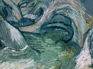
Vincent Van Gogh’s Ravine (1889) sits in the Impressionist Room of the Boston MFA, a breathtaking work of cool, subdued colors and broad-brushstroke technique. Set in a bright room under light cascading and reflecting off the other Impressionist works, Van Gogh’s Ravine is not immediately eye-catching. In contrast to the other works in the room by Signac, Renoir, and Monet, Van Gogh’s piece, though painted in the same Impressionist style, is not done in bright fluttering colors, but in cool tones of grays and blues that provide a more subtle feeling upon viewing. While the Renoir pieces to its right and left rely on heavy pinks, oranges, reds, and yellows, Van Gogh’s Ravine seems almost to hide from the eye at first, rather drawing its power from its simple and subdued cool impressions.

Van Gogh’s “Ravine”; 1889; image courtesy of the MFA, Boston, MA
Utilizing the full spectrum of cool tones to paint the ravine walls, Van Gogh creates an undersea aura as he decorates the gray ravine walls with splashes of green, blue, and white. As the charcoal-gray tones set the backdrop for the ravine, Van Gogh’s introduction of the blues over it breathes into the work a sense of depth without which it would seem plain and flat.
A Clever Eye-Line and Clearly Cut Contours
Van Gogh illustrates for the viewer an eye-line looking directly along the ravine’s bottom, as if one were standing in the ravine itself. With his use of gray and black to sketch the cuts of the ravine walls, Van Gogh starts to depict for the viewer the illusion of a three-dimensional landscape. Yet if Van Gogh were to have used his blacks and grays exclusively, his illusion of a three-dimensional scape would not have been as effective as it is. By introducing blues and whites, Van Gogh takes his three-dimensional construction steps further. The navy coloring along the edges of the river carves out the path the flowing water takes as it winds its way through the canyon, and his use of grungier and brighter whites along the ravine walls creates for the viewer a sense of movement in the water.
Curvature of the river’s cared out path
Movement Through Color
With the water movement outlined through his masterful use of blues and whites, Van Gogh then turns his brush towards giving the rushing body a depth for the viewer’s eye. Contributing sea-greens to the rushing bend of the water in the foreground of the painting, Van Gogh succeeds in creating for the viewer the illusions of depths of water flowing over one another, as the surface rushes and crash into bursts of white and light gray along the sides of the ravine. Indeed, Van Gogh uses particular colors to cut contours as well; his use of black (rather than a use of navy or gray) to cut out the small recess in the foreground of the painting makes the recess all the more stark and powerful, contributing to the overall movement-aesthetic of the work.
But perhaps Van Gogh’s greatest triumph in his color-usage in Ravine is the way he uses his colors to create movement and power in other areas besides the river. In the top recesses of the painting, Van Gogh uses lighter blues over grungier whites and splashes of navy to create the same moving sky as in many of his paintings. Indeed, the movement in the sky seems to mimic that seen in The Starry Night (1889). More than that, though, the sky seems to mimic the water of the river: the light sky-blues laid over the navy’s and whites create a rippling effect evocative of light on water.

The light-blue rippling sky above the ravine
With the sky rippling above, Van Gogh sets about creating the walls of the ravine. There, sharp contours of black cut in mismatched and jagged patterns alongside gray rock-faces and navy shadows. The most striking thing about the way that Van Gogh paints the ravine walls is the strokes with which he does it; rather than straight lines intersecting at random points, Van Gogh uses swirling brushstrokes to create a flowing downward motion and feeling, opting only to create a few jagged protrusions toward the ravine’s bottom. In doing so, Van Gogh presents the walls of the ravine not as entities separate from the river and sky, but as similar parts of the same whole.

The flowing sea-like plants on the ravine’s wall, right side

The flowing sea-like plants on the ravine’s wall, left side
Upon the ravine walls, Van Gogh paints flowing canyon plants in red-oranges and sea-greens, with the plants having the added effect of resembling sea anemones and underwater seaweed. By adding such unique plants to the sides of the already flowing walls of the ravine, Van Gogh completes his creation of a marine world within the walls of the ravine. As if mirroring the flowing currents of an ocean or river, the waving plants dot the upper sides of the canyon walls, creating a “pop” for the viewer with their bright colors against the backdrop of the gray-blue-white walls.
Little Eddies of Stillness
Perhaps the greatest expression of movement with color in the painting, though, is Van Gogh’s use of dark grays and white to create boulders in the bottom portions of the work. In using such colors coupled with his curved brushstrokes, Van Gogh creates portions of the painting that act as metaphorical voids of movement; these voids are perhaps the only “stable” parts of the work, and in turn starkly contrast with the portions of the painting where real movement flows. For example, the boulders in the lower left-hand corner of the painting exhibit a very different type of brushstroke than that used to depict the plants and river around them. With their curved, almost subdued brushstrokes, the boulders create a break in the movement of the brushstrokes around them. Like an eddy in a river disrupting the initial inertia of the river’s flow, the boulders serve as barriers against which the movements of Van Gogh’s other brushstrokes crash.

The boulders in the lower left corner, providing a stillness
With his brushstrokes long, loose, and flowing and his paint thickly applied, Van Gogh adds to Ravine the same feeling and effect as exhibited in his more famous works such as The Starry Night and Bedroom in Arles (1888). As in his painting The Starry Night, Van Gogh utilizes the technique of dividing the painting into sections, with each ravine wall making up a triangular section and the sky completing the final area.
Black and White
Still, though, one of the most intriguing aspects of the painting is not Van Gogh’s usage of marine and tropical colors, but his use of black and white. Indeed, Van Gogh uses white as a true color rather than a place holder, making use of different shades, with bright white “popping” off the walls of the ravine and the surf in the middle of the work, and a more subdued white blending with the blues in the sky. Van Gogh addressed this notion of black and white color usage in a letter to Émile Bernard in June 1888, stating, “I am going to put the black and the white, just as the color merchant sells them to us, boldly on my palette and use them just as they are” (Chipp, Theories of Modern Art, 1968, p. 32).

Black strokes blended with the greens and blues
True to his declaration in his letter, Van Gogh uses the colors black and white as real colors in the work, not simply as backdrop colors to make the other colors of the painting appear more vivid. Rather than using black simply to define the lines and contours, Van Gogh blends black strokes in the with green plants, using it to add shadow and depth to the motion and flow of the plants along the ravine walls. Similarly, rather than using white to create a simple void on the canvas where other colored paint colors do not appear, Van Gogh blends in in the with river movements and the along the lower cliff faces, creating the rush of the surf crashing along the canyon walls.
Marine World
With his usage of broad brushstrokes, thickly applied paint, subdued colors mixed with brighter “popping” ones, compartmentalization within the painting, and rippling movement, Van Gogh’s Ravine is a brilliant tapestry of masterful techniques. Creating an almost marine-like world in the middle of a ravine, Van Gogh plays with something as basic as the setting of the painting, while at the same time still delivering strong movement through broad strokes (the river and the canyon walls) around areas of rest (the boulders). In pulling all of these aspects together, Van Gogh experiments not only with the nature of flow and movement, but also with the effects of particular colors upon those very motions.

Reblogged this on Don't Dress Like Beethoven.
LikeLike
Pingback: Blogging: One Month In—A Retrospective | Adam Marx's Mind